A pump curve, or performance curve, is a graph that shows how a pump’s flow rate changes with pressure (head). It helps you understand how a pump will perform under different conditions so you can choose one that suits your system.
The curve usually starts high on the left, where the pump produces high pressure at low flow and slopes downward to the right, where flow increases but pressure drops. This is because a pump generates more pressure when moving less water, but as flow increases, pressure naturally decreases.
Different pumps are designed with specific flow and pressure capabilities to suit various needs, from industrial use to home and lifestyle applications.
Below are simple explanations of the key parts of a pump curve graph:
Flow Rate (horizontal X-axis):
- Measured in litres per minute (L/min) or cubic metres per hour (m³/h).
- Can be marked as ‘Q’ on the graph.
- As you move to the right, the flow rate increases.
- Flow rate tells you how much water the pump is moving over time.
Head (vertical Y-axis):
- Measured in metres (m).
- Head shows the pressure the pump can create, or how high it can push water.
- Think of it like holding up a garden hose the higher you lift it; the more pressure you need to get water to the top.
- As you move upwards, the pressure (head) increases.
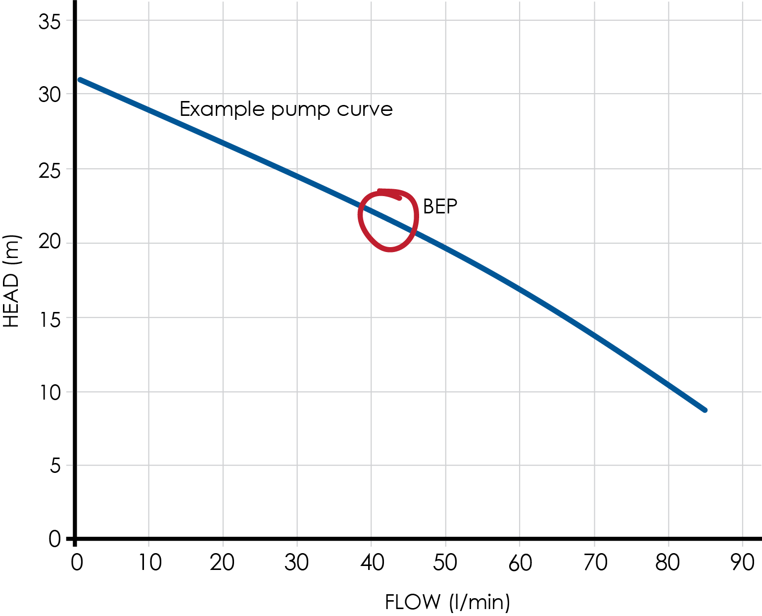
Best Efficiency Point (BEP):
- This is the sweet spot where the pump runs most efficiently.
- At the BEP, the pump gives the best performance while using the least energy.
- It’s usually around the middle of the curve.
- Running a pump near its BEP means less wear, lower costs, and better results.